Exploratory Data Analysis (EDA) - Hello World
- Jatin Madaan

- Sep 11, 2019
- 4 min read
Updated: Sep 13, 2019
To know data better EDA is done , in Data science EDA on Iris Flower dataset is like Hello World in any programming language .
About Iris Dataset
A simple dataset to learn the basics.
3 flowers (setosa,versicolor,virginica) of Iris species :
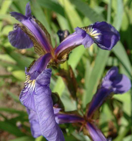
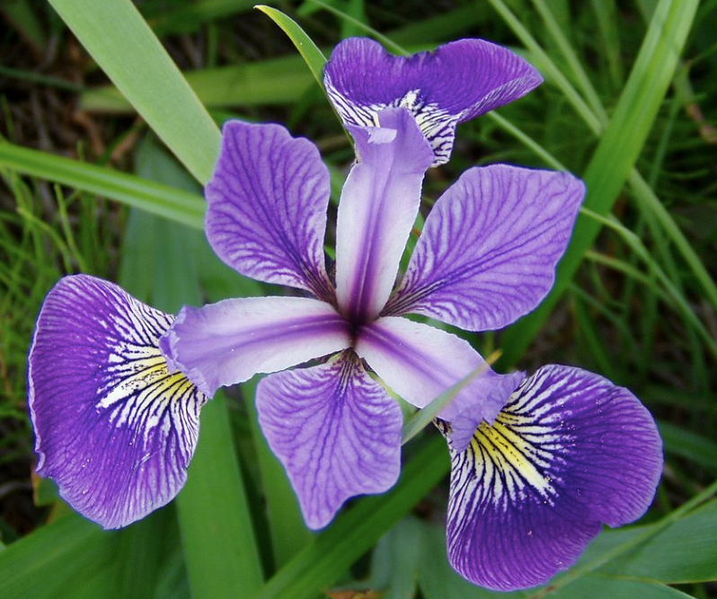
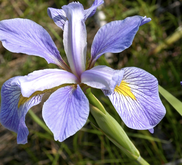
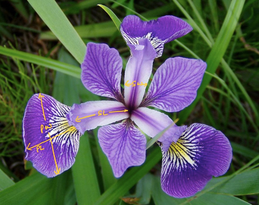
Objective : Classify a new flower as belonging to one of the 3 classes given the 4 features (PL - Petal Length, PW- Petal Width, SL- Sepal Length,SW-Sepal Width),these are most important 4 features given by researchers which help in unique identifications . e.g -
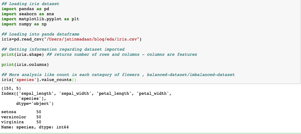
Basic analysis on dataset : It includes checking number of features (columns), data-points (rows) , names of features/columns , count of types for each species , balanced-dataset & imbalanced-dataset check etc .
Balanced-dataset - If for every distinct feature we have almost similar data-points then we call it as balanced-dataset as here below iris is balanced dataset.
Imbalanced-dataset - Let say we have to classify if patients in a hospital are diabetic or not based on certain features then it unlikely that 50% are diabetic , here only 10-15% data-points state a person is diabetic or not .eg : in total 1000 data-points only 100 are diabetic and others not then this kind of dataset is called as imbalanced-dataset.
eg :
2-D Scatter Plot
In these kinds of plots it is important to understand about labels and scales .
To make easy to understand use color points for labels .

Observations :
Blue points ie Setosa flowers can be easily separated from red and green by drawing a line (y=mx+c) .
We can draw and check for different features one by one and check which one is best to separate all 3 .
4C2=6 , combinations of graphs are possible .
Using SL and SW features , we can distinguish Setosa flowers from others.
Separation of Versicolor and Virginica is much harder as they have considerable overlap.
3D Scatter Plot
We can analyse data using 3d scatter plots but it needs lots of interaction using mouse to interpret data .It is difficult on paper as well to visualise.
Humans can only visualise easily 3-D , whereas 4D ,5D ...ND cannot be visualised .
For this we have Pair-Plot.
Pair-Plot
Pairwise scatter plot is called as pair-plot
It cannot be used when number of features are high as number of graphs for 4 features with pair of 2 is 4C2 ie 6 , for 100 features 100C2=4950 graphs to visualise.
Cannot visualise higher dimensional patterns in 3-D and 4-D.
Only possible to view 2D patterns.
eg :

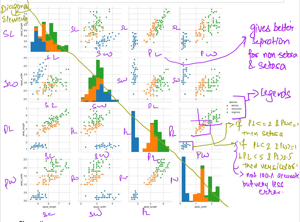
Observations :
PL & PW are most useful features to identify various flower types .
While setosa can be easily identified (linearly separable) , Virginica and Versicolor have some overlap (almost linearly separable).
We can find "lines" and "if-else" conditions to build a simple model to classify the flower types.
HISTOGRAM, PDF, CDF
1D scatter plot using one feature
Hard to make sense as points .
There are lots of overlapping .


HISTOGRAM PLOT

Above analysis is also called as univariate analysis - One feature analysis ie PL,PW,SL or SW.
Farther the tail better is classification . (long tail is not good ) .
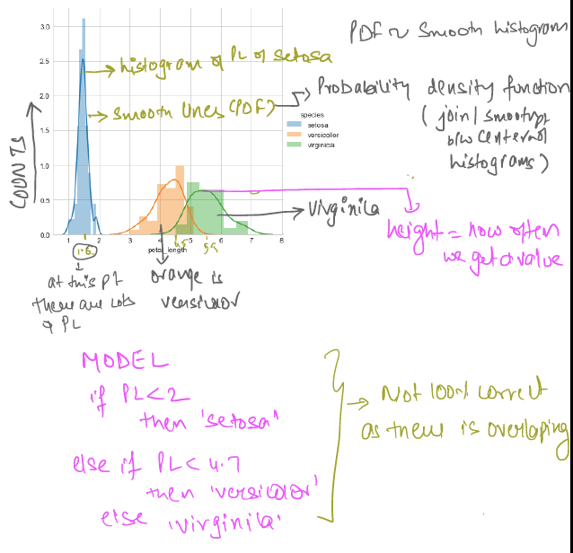
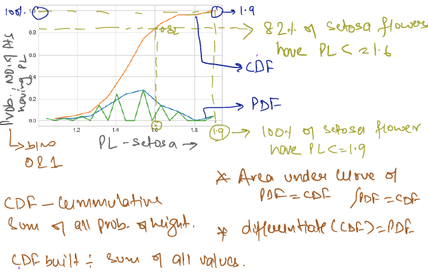
CDF & PDF
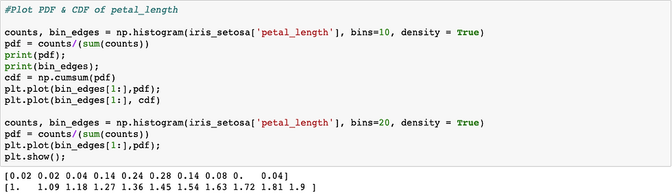
Below is code and analysis CDF and PDF for setosa flower :
Now checking for all 3 flowers PDF and CDF :
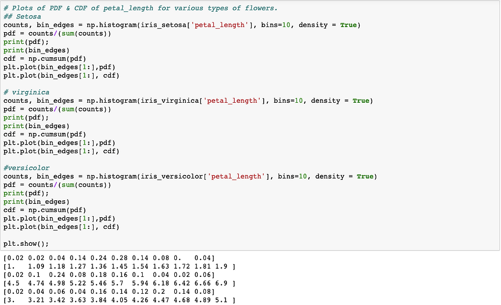
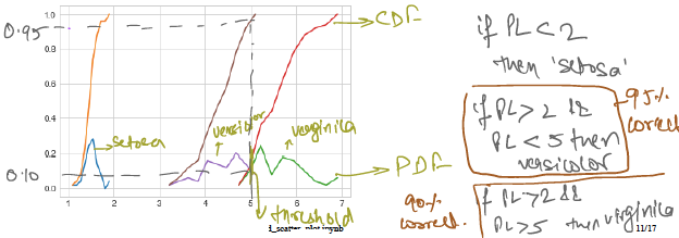
Above analysis is for only petal length , we need to do similar for all 4 features to get correct classification with less error.
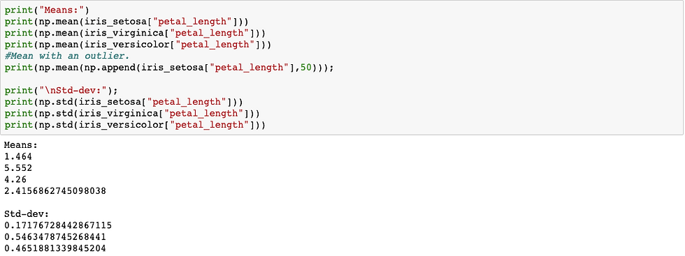
Mean,Variance and Std-dev
Mean tells central tendency (average length ) .
Variance(spread) is avg. of square of distance from mean. - It tells how far away from mean.
Std-dev is square root of variance
eg:
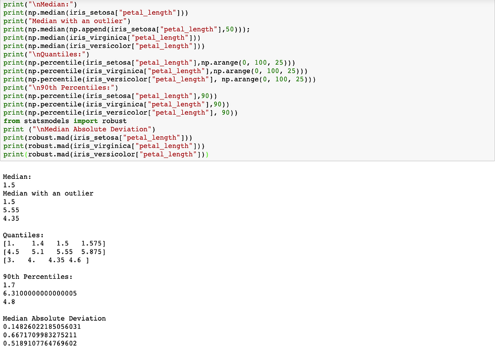
Median , Percentile, Quantile, IQR and MAD
Median is similar to mean of central tendency (sort and pick middle value) but outlier problem does not occur for all cases where data is at-least 50% correct.
Percentile : let x(sorted list) = {x1,x2 ....x50,x51,.....x100} in this sorted list 50th value is called as 50th percentile ie 50th rank , e.g. if value of x50[10] then it means 50% of points are less than 10 and 50% more than 10 .
0th , 25th, 50th and 100th percentile is called as Quantiles. 50th percentile is also called as median or half-value. Percentiles are useful in delivery times in e-commerce.
IQR (Inter-Quantile range) - values between 75th percentile and 25th percentile are called as IQR.
MAD (Median absolute deviation ) - std-dev is square root of average distance from mean ie how far from mean , Whereas mad is how far from median (square root of avg distance ). MAD does same what std-dev does.
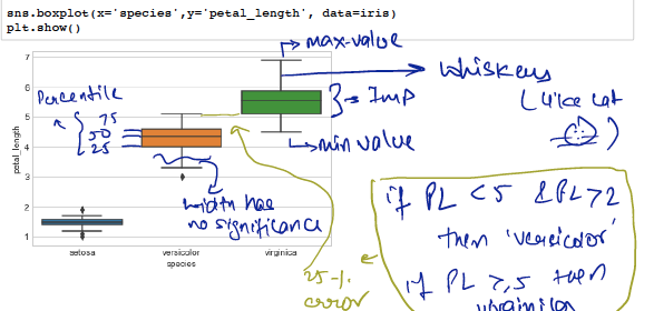
BOX PLOT & WHISKERS
Box-Plot is another method of visualising the 1-D scatter plot more intuitively .
Whiskers are drawn either by taking max or min value or can use any other statical model (seaborn uses 1.5 * IQR) .
It is IQR like idea .
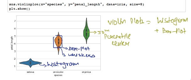
VIOLIN PLOTS
It combines benefits of box-plot and histogram plots .
Denser regions of the data are fatter and sparser ones thinner.
Univariate , Bivariate and Multivariate Analysis
Analysis using 1 feature/variable is called univariate analysis .
Bi-variates are analysis on 2 features (eg : pair-plots) .
Analysis on 2 or more than 2 variables is multivariate analysis eg contour plots (used by geologists). : Max points are in centre and as we move out it means less points it's like a mountain/hill height .
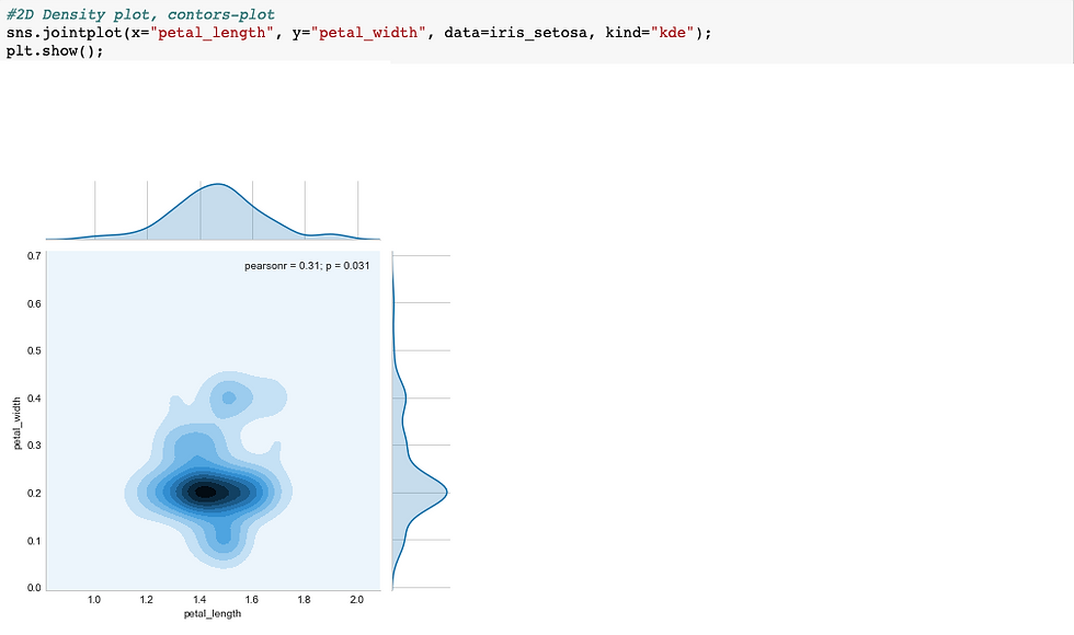
Above is contour density plot.

Comments